Thursday, 29 April 2010

Evaluation by Jason Grandison

Q1: In what ways does your media product use, develop or challenge forms and conventions of real media products?

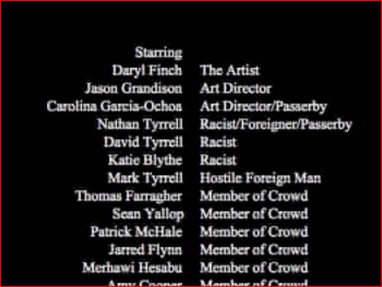
Since the birth of cinema all films were short and often comprised of twisted of controversial themes that are observed in our society. Such themes may be displayed in a surrealistic nature. For instance, themes such as consumerism, unemployment, crime, and justice are commonplace. They are usually focused on contemporary British society and engage the audience with confrontational issues that many would rather remain oblivious to. Their purpose is usually educational, experimental or to showcase new talent. Our short film explores notions of British culture and identity. Full-length feature films are very different. They are essentially interested in making money, by entertaining the audience, not necessarily to educate them. Some feature length films such as Danny Boyle's “Trainspotting” do raise awareness of social issues. However, our film's purpose was to entertain though we wanted to tack a serious issue, racism, in a light hearted-way which is not the norm in social realist films so there is a message to be learnt from our film.

Our short film product would fit in the comedy genre with some surreal documentary elements although a serious message is being portrayed. Some scenes seem very surreal which is a common element in short films.


Our film was shot using a DV camera which gives a gritty effect, and with kinetic movement, a sense of reality was emphasised, something common in short film. There is little dialogue used but several scores running throughout. The narrative structure of our film is linear and circular with a three part structure with a beginning, middle and an end. The titles are left to the end which keeps to the norm of a short film.


The stylistic forms and conventions of our film makes it pretty standard for a short film. However, we developed our film and updated some of the standard conventions. We took the conventional purpose of a short film to educate the audience but highlighted the comedy element, making our film more experimental and entertaining while raising awareness of issues, therefore challenging forms and conventions.

Magazine reviews are a clever way of advertising films through their use of synergy as well as cross-promoting products that may interest certain audiences; recommending new productions to readers and providing exposure for genres which they may have not witnessed previously. The main distinction to be made between a film review and an advert is that film reviews are not always favourable as they are produced by a third party.

Depending on the institution producing the film magazine, it may be biased in favour of all films, while others may analyse in an academic and critical way. In the majority of film reviews, there is a synopsis on the film as well as opinion and analysis. The level of analysis and opinion varies depending on the institution producing it. They often make assumptions about its readers. The audiences for these various film magazines can vary to a large extent.

Our magazine article neither challenges nor develops forms and conventions as the technical layout is quite classic - there is a main image, a main text body divided into columns with a layout from left to right, a breakout box, a main image and a subsidiary image. We decided to keep it a standard, classic layout as it’s what the audience expects so it’s more accessible for the audience to read form left to right which can be seen in several magazines like 'Empire' and 'Sight and Sound'.


Film posters are fundamentally advertisements which are intended to promote the production to a targeted audience. They aim to indicate the genre of the film and attract audiences in doing so. My target audience was primarily those of 15-25 years of age. However, it is still appropriate for the older generation.

We looked at a range of posters like 'Bridget Jones' Diary' and 'Bend it like Beckham' and they all seemed to follow the same basic path of forms and conventions - images of the mainstream star(s), as well as their name(s), a billing block, a tagline and of course a title.


We decided to challenge the conventions of a typical film poster by including the name of the main actor despite not being a Hollywood star that anyone would know about. This isn’t the normal form and convention of a film poster and we developed it to look more mainstream and professional to appeal to a wider audience.

On the whole we decided to keep the main forms and conventions throughout our media products to allow our products to be more recognizable and accessible for the targeted audience. We decided to modify our film to make it appeal more to the mainstream. We chose to show our film poster and our magazine review in a mainstream way for our short film enabling us to reach a wider audience.

Q2: How effective is the combination of your main product and ancillary texts?

In terms of genre, I think the combination of our short film, magazine review and film poster work well together. There is a comedy element that flows through each of the products which is very much cohesively evident. This is effective because it targets a particular audience. I think it works pretty well together in terms of communicating the narrative to the audience.

To a certain extent we were influenced by other media products such as the cover of 'Here you come again' by Dolly Parton and as well as 'Help!' by The Beatles.


The decision to put the title on the canvas was influenced was Gillian Wearing. She is a well known artist who looks at identity culture and did a collection of images called “things people want you to say but not what they actually say”.


I found this made our poster much more creative and effective.


We tried to follow the similar comedy element throughout our film which is seen within our poster as well as our film magazine review. However we feel that message of genre is not as strong with exception of the main text which utilises its own format rather than implementing ideas that the film company has produced.

Our film certificate is 12a. We considered adhering to the 15 classification though the end product didn't feature content that justified this. This particular classification permits a younger audience than the target, and of course doesn't limit the older generation, attracting a wider audience. Nethertheless we felt the narrative of the film was clear and could be identified without having any previous information of the film. I believe that we have created a product that is satisfactory for our audience. The film is about a immigrant artist who struggles to get by in life within the UK. It’s not how he pictured it to be, but there is no specification of the struggle with our film poster. We decided to do this to reach a wider audience with the audience wanting to know more about the film, although it could give the wrong impression of the narrative. Our film article and poster is targeted at the younger generation as well as the older generation as we did not think there is a need to specify it, especially the film magazine. For example, in 'Sight and Sound' which is a much more formal, intellectual magazine, they reviewed a range of films from ‘U’ to ‘18’.


The film poster approaches the audiences who want to see something of a comical friendly vibe. The magazine review is also fun and witty and approaches that kind of people. It was necessary to target different audiences across different products to enable a wide range of people viewing our film. I believe all 3 of my products work together to reach a wider target audience.

From an institutional point of view, the magazine and poster have different purposes. Audiences may use different products in different ways. For example, they may look at the poster for the genre of the film or may look at the review for a more subjective analysis of the film. The film poster makes you want to see the movie while the magazine article is more independent and gives the audience a third party’s opinion whether or not the film is worth seeing. It allows our film to reach an even wider audience as we followed the normal forms and conventions. It is vital to attract a wider audience and I believe we did achieve this in all three products.

The relationship between the three products from an institutional point of view is to advertise and make it appeal to the audience. Magazine articles discuss and make people want to see the film, endorsing it. The film companies want their film reviewed in magazines as it’s like a third party’s opinion. However sometimes this can make or break a film. It is very desirable from a film companies’ point of view even if the film has been produced as they want to circulate awareness and distribute it, raising viewing figures.

Film posters and magazine articles are important parts of the film as they are the key components to the distribution. It gets your film noticed from a short film to a wider distribution appealing to different audiences. They give the audience an insight to the film, marketing it, but also tells the reader where it can be accessed.

On a production level all three products work together. They complement each other well - we used a screenshot from our film within our magazine review and we used the main image from our film poster in our magazine review. We also took pictures during filming to produce our poster.


Q3: What have you learnt from your audience feedback?

Audience feedback is an important element when creating media products as you need feedback in order to correct faults as well ensuring you are reaching your target audience.

We received audience feedback for the short film after presenting it to the class. It mostly stated how they thought film was very entertaining, though unclear at times. Some scenes also dragged on too long. We listened to the advice and developed our film to make it clearer. We cut some shots as well as shortening some scenes.

“The ending was unclear”

Another criticism was about the sound being incoherent and as well as the same score being played too frequently, causing a nuisance.

“The volume is jumpy”

Therefore we used headphones and listened carefully to the score thoughout the film, editing the essential areas of sound. We also found a greater variety of suitable copyright free music which we rearranged throughout the film.

Additionally, during the creation of the film poster, we listened and took action upon the feedback we got from the audience. We made several posters and experimented a lot. We had options such as just silhouettes of the cloned actor, as well as coloured and ordinary faces.

“Is it about aliens?”

However the audience thought we should keep it simple and stick with the normal colour faces as it might give an unclear impression that our film is about aliens or another unintended meaning.


Below are two finalised examples of our final poster.


However the audience thought the red background was bold but the white was more prominent.

Technologies like Photoshop and desktop publishing helped string together our final outcomes. The end results were visually pleasurable for our film magazine and poster although we mostly stuck to the normal forms and conventions and made it look professional.

Q4: How did you use media technologies in the construction and research planning and evaluation stage?

Throughout our research and planning, we learnt a lot about technology and utilised new technologies within the process of constructing our products in order to accomplish the final result.

We used a D.V. camera which is quite dull and gritty, unlike the look given in mainstream, Hollywood films and American soaps which use “celluloid film” which give a much nicer, brighter effect, giving the impression of perfection - perhaps not quite appropriate for out type of film. However, this was all that was available for us. Filmmakers decide whether to use film or digital video cameras depending on the effect that they want i.e. realism. To make up for this, we used upbeat scores and facial expressions to reinforce the comedic, surreal elements.


In terms of sound, we lacked microphones which affected our product as the digital camera was not of high quality so we used as little dialogue as possible.

There was also lighting limitations in some shots in our film but we overcame them by just working with what we had and making sure all indoor lights were on and we shot the outdoor scenes early in the day. So we overcome these limiting factors.

Also, during editing, we used iMovie HD which is non-linear editing software which allows you to move footage around in any order. This was quite useful as it allowed us to drag and drop and cut footage easily giving an awesome effect. However non-linear editing affected the overall product as it we could free move footage around, changing our mind, so the film doesn’t exactly match the original storyboard or script. Nethertheless, it was quite effective as we was able to further develop the film in the editing suite.

The internet was a vital component for us. We used the internet throughout our research and planning, independently gathering information on existing products and viewing existing products on video sharing sites such as Google Video and Youtube.

We also used free sound effects sites like freeplaymusic.com as you can download free copyright music which directly influenced the overall product. We also used iMovie HD and GarageBand for adding the extra sound effects such as the “squeaky door”. We also used the internet, in the form of blogging, to publish research and record progress and planning such as shooting schedules. Our blog utilises ICT greatly as it allowed us to upload images and links, creating much more interactive research and planning.

Our film was given coverage when we published it on YouTube - a video sharing site allowing continued feedback. It can be seen here well as on Facebook.

Moreover, we used a digital camera to capture images for our poster. This was very straightforward and quick at uploading. We then used “Photoshop” photo manipulation software in order to edit and manipulate the images easily. We were influenced by the layering tool on Photoshop allowing us to use several images and then flatten the image into one in the end. This was very beneficial in our development stage allowing us to construct more than one image allowing us to create a complex, artistic poster.

For our magazine review, we used desktop publishing software called Pages - a straightforward way of layouting articles. Most magazine and newspapers use software like “QuarkXPress”, but Pages is less technical and simpler.

Both Photoshop and Pages allowed us to be very creative and experimental allowing us to try out different layouts and ideas for both our poster and magazine review. They are both non-destructive software and so allowed us to be creative and adapt our ideas easily, reacting to audience feedback.

Monday, 26 April 2010

Evaluation by Daryl Finch

1. In what ways does your media product use, develop or challenge forms and conventions of real media products?

In terms of our product being a short film, there are established forms and conventions which most films of this kind will tend to follow. In terms of purpose, they are often educational or experimental; or a means for showcasing new talent or promoting ideas for a feature-length film. Our film, however, was intended as a means of entertainment but with a serious message about society incorporated within it. So, to a certain extent, we are following the norm here in that there is a message to be learned from our film, but with there being no overall aim for a full feature length film, or any desire to further our acting careers, our film would be a bit of an anomaly.

In terms of style, short films often play upon elements of surrealism, though using a realistic situation. In the case of our film, the way in which the final scenes are edited makes it feel somewhat surreal. However, the film, on the whole, tells a believable story.


Short films are often gritty with kinetic movements used. Our film, through our choice of camera, but also the way in which certain shots were filmed, demonstrates this. Dialogue, as typically, is kept to a minimum in our film, and it follows only the one main character. The narrative structure is linear and circular with a three part structure - a beginning, a middle and an end. Additionally, the titles are left to the end. With regard to these stylistic elements, our film hasn’t strayed too far from the ‘norm.’


Our film can be considered as being pretty standard as it uses most of the forms and conventions of a short film in terms of style, but it isn’t typical as far as purpose is concerned. We have developed the standard purpose of ‘education’ but have made entertainment the sole purpose while maintaining the overall moral message. Considering whether we have challenged any forms and conventions of short film, I think it would be difficult to justify saying that we had.

When looking at film posters, even the most avant-garde examples still follow the most basic forms and conventions. They will usually contain images of the main star(s), along with their name(s), then other secondary/background images. Then, of course, there will be the title, tagline, and billing block.


Our poster, though using less conventional images, still has the aforementioned elements. Though the main actor (me) isn’t of Hollywood calibre, it wouldn’t make sense not to include my name on the poster, given the fact that I appear on it several times!

Given audience expectations, we decided that the ‘standard’ elements of a film poster should remain so as not to make it unclear as to what it was trying to portray/advertise, therefore we didn’t develop or challenge forms and conventions here.

Our magazine article neither develops nor challenges forms and conventions as it sticks mostly to what you would expect to find on a range of film magazines from Sight and Sound to Empire. There is a main image, a subsidiary image, a main body of text divided into columns, a breakout box, and the layout is from left to right. We made this decision based on the fact that no other magazine layout seems logical and that all magazines are laid out in this way for a good reason.

Overall, we stuck mostly to generally recognised forms and conventions to ensure a sense of familiarity among our target audience. With it being a short film, we wanted to attract as large an audience as is possible for a short film by treating it as a full length film in terms of the way it is portrayed in the film poster, as well as how it is sold via the film magazine review. We also modified the purpose of our film to make it appear more ‘mainstream,’ and therefore more accessible to a wider audience.

2. How effective is the combination of your main product and ancillary texts?

When looking at genre, what we aimed to convey through the three texts was the humour; rather than the multicultural element. I would consider that humour features heavily throughout the film and is conveyed to a certain extent in the article and the poster. We have pastiched, to a certain the degree, the cover of the Help! album by The Beatles, but also Here You Come Again by Dolly Parton. Anyone who can recognise this will be able to notice the humorous intentions.


The facial expressions which are such a key part of the film are seen again in the film poster. In the magazine review, however, the communication of genre is less strong, apart from in the main text. With it supposedly being from a third party, it uses its own format rather than adopting and incorporating ideas from what the film company have produced.

We feel that the narrative of the film can be understood without having to have any prior knowledge of the film, although, with regard to the film poster, we feel that it’s unable to provide an absolutely clear idea to the target audience as to what the film is about. What is clear is that the main character is involved in art, but there is absolutely no indication as to any of the struggle he has to encounter, nor the eventual outcome. This was a conscious decision on our part as we felt that the idea of a film poster was to provide an insight and leave the viewer wanting to find out more, rather than giving everything away. You could say that the poster was more misleading than the article as the poster was left to the viewer’s own interpretation, without the ‘facts’ laid out for the reader.

While my film and film poster are targeting the same audience, the fact that the magazine review is an independent, third party endorsement means that it will be brought to an even wider audience. My film and poster are both targeted at 15-25 year olds whereas the film magazine in its advertising profile aims to target the ‘Average Joe’ - your general ‘film buff’. This widens the audience slightly in terms of age, though focuses slightly more on males. However, on the whole, my wider target audience is reached by all three products. It is necessary to target different audiences across different products as all of the targets will intersect and therefore attract a larger, more varied audience. The audience will use the film poster for judging whether or not they want to see the film, or at least know more about it. The magazine review, as produced by a third party, will be where our audience goes for an impartial second opinion before making a judgement as to whether they will see it.

This is why the poster and magazine review are an important part of a film’s marketing and distribution. They both spread awareness about the film itself, but also alert the reader to where it can be accessed. From a film company’s point of view, a good review in a film magazine is very important. It is an endorsement from a third party, something not produced by the film company itself, so therefore of greater value.

The three products worked extremely well together on a production level too. Photos were taken during the filming to produce the poster, and a screenshot was used of the film to provide the main image for the magazine article. The main image from the poster is also incorporated into the article.


3. What have you learned from your audience feedback?

When creating media products, audience feedback is vitally important in ensuring that you reach your target audience. It helps to identify any faults before it goes on general release. Although a film may make perfect sense to the people who created it, it’s the target audience that has to respond positively to it.

We presented the first draft of our short film to the class and the general feedback was that it was on the long side, and that the ending was a little unclear. In response to this, we added extra shots of applause at the end to make the conclusion a lot more explicit. On the whole, we took the advice on board, shortening some scenes and removing a number of shots.
"The ending could be more clear."

Another criticism was that the sound levels were quite inconsistent, and that the score was quite repetitive, and to a certain extent, irritating. So using headphones, we paid close attention to sound, editing it where necessary. We also rearranged the score, finding more suitable copyright-free sounds to add variety.

"The music annoyed me!"

In creating the film poster, we acted upon audience feedback during the creative process. We had options available to us, such as the choice between coloured faces and ordinary faces. Audience feedback dictated that we shouldn’t adopt the coloured faces as it was unclear what, if any, suggested meaning there was.


One the poster was finalised, we experimented with a red background but audience feedback also dictated that the white background was much more effective.


As we mostly stuck to convention with regard to the film poster and magazine review, the end results were found to be, on the whole, aesthetically pleasing. There were few objections as they took the basic format of products already seen. Having used Photoshop and Pages, it was agreed that the look was professional overall.

4. How did you use new media technologies in the construction and research, planning and evaluation stages?

Throughout this project, we used a broad range of new technologies to reach the final outcome. Throughout research and planning, the internet was very important. We used the web to conduct research into background information and existing products, using sites such as Youtube, but also Google Search. Through the use of a blog, this allowed research and all other progress to be recorded, as well as for planning shooting schedules.

During production, we used D.V. cameras as that was all that was available to us. iMovie HD was the editing software we used as it is the easiest non-linear editing software, where you can freely edit in any order; developing your final film in the editing suite. This helped us to improve upon the original storyboard idea and to react upon the feedback we received. This software was designed for D.V. cameras, so provides ease with regards to importing and storing footage, in comparison to celluloid film.

D.V. cameras tend to be more gritty and realistic, compared to the more artificial look of film. For us, this was a limitation as a more vibrant and artificial feeling may have suited our film better and enhanced it as a spectacle.

The fact that we didn’t have microphones to use has directly influenced our film. Because of the fact that sound is difficult to clearly pick up when outdoors, our film uses only a few lines of dialogue. However, the consequent reliance on animated and expressive facial expressions to convey meaning has been considered one of the strongest creative decisions of our film; despite being influenced by sound limitations.


Lighting was also an issue, but we overcame this by ensuring that all indoor lights were turned on, and that all outside shots were scheduled during daylight hours. These were both limiting factors but having considered them beforehand, we were able to avoid any potential difficulties.

For our score, we had to seek out copyright free music and so used websites such as freeplaymusic. For a length of film such as this, this was preferable to using programmes such as Garageband to create our own score. Extra sounds effects such as the squeaky door were found on iMovie.

In making the poster, we used a digital camera to capture the images which has the advantage of easy upload. Photoshop was then used to manipulate the images with relative ease. The image manipulation and ‘layering’ capabilities influenced the design and eventual construction of the poster, resulting in a ‘collage’ of images, rather than limiting us to staging one single image.

To form the magazine layout, we used Pages which is a simple way of laying out documents no matter what type. It is a less sophisticated programme than QuarkXpress, for example, which is used in the magazine/newspaper industry, but for our level of design skills, was apt enough for the task.

The evaluation has also been enhanced by the use of the Internet, allowing for images and links to be incorporated, while the whole project is kept together and in order.

Our clip was given exposure as a result of both Youtube (film can be found here) and Facebook but these websites were also useful for viewing and using existing clips. We must acknowledge the size of the role that the Internet plays in projects such as these. You can see that at all stages, it has played a role. Short film in itself has experienced a comeback of sorts as a direct consequence of the video/file sharing capabilities of the Internet.

Monday, 8 March 2010

Film Poster (Planning)

Title:
  • The Artist
Target audience:
  • 15-25 age
  • Male and female
  • Same target audience as for film
Possible Themes/Genres:
  • Highlight multicultural element
  • Scenes of multicultural Britain in the background
  • Comedic elements
Possible Taglines:
  • If you don’t buy a ticket, you don’t win the raffle
  • You’re never too far from a brush with success
  • Pour myself a cup of ambition...
  • From Armenia with ambitions
Possible Images:
  • Artist holding canvas,with film information on canvas
  • Artist with head through canvas
  • Multiple images of artist, holding canvas, in different positions.
  • Background = typically British/multicultural
  • 'A' in artist, in the shape of an easel
Initial Ideas:

Artist 'action shot' with a collage of typically 'British' scenery.
Artist's head through a canvas - quite a striking image.

Artist holding canvas on which the title of the film is written.
This is the idea we settled on - a collage of different images of the artist holding a canvas, each with a letter which makes up the title of the film. Influenced by Help! and Here You Come Again album covers.

Final poster:

    By Daryl Finch, images by Jason Grandison

    Tuesday, 2 March 2010

    Magazine Article (Planning)

    Possible Titles:
    • FILMagazine
    • Full Film
    Advertising profile:
    To review the latest, Blockbuster films that the ‘Average Joe’ will want to see. However, the aim is also to give coverage to new, independent film, and also short films which people would not normally have been exposed to – making it accessible and also an appealing alternative to the norm.

    Target reader profile:
    • Favourite breakfast cereal? Special K
    • Drives... A Small French car
    • Lives in a... Flat/Apartment
    • Drinks... Wine/Foreign Beer
    • ... in a... Gastro pub/wine bar
    • Watches... Coronation Street, Spooks
    • Listens to... Belinda Carlisle, The Carpenters
    • Favourite dinner? Lasagne
    • Favourite activities? Walks in the park, spending time in cafés with friends
    • Favourite holiday destination? Sicily
    • Votes? Yes – Labour
    Mode of address:
    • Formal, informative, impartial: 'The Artist' - a new short film exploring ideas about multicultural Britain, but with a humourous take. Daryl Finch takes the leading role as an aspirational artist, arriving from foreign shores...
    • Less formal, more partial: 'The Artist' is a fantastic new short film soon to be released, starring Daryl Finch in the title role. Humour and colour are added to a story which touches upon issues of multiculturalism...
    • More informal, partial: Daryl Finch stars in an epic new film which follows a foreign boy who searches out his dream to be an artist...
    Additional content:
    • "You might like this, if you liked these films..."
    • A star rating
    • Director quote
    Possible layout:
      By Daryl Finch

      Monday, 1 March 2010

      Storyboard


      By Jason Grandison